
Guest post by Jessica Bell
Are your books sales dwindling? It might be time for a book cover makeover.
When an author comes to me for a cover makeover, I get excited. I get excited because it’s a sure sign of an author wanting to do things right and a sure sign of their trust in me.
It means that the author has been through the book cover design process before, or at the very least, truly realized why a professional cover design is essential in today’s competitive book market.
The book’s cover is the first thing a potential reader will typically see, even before reading the description. It’s important because it’s a reader’s very first (and uninfluenced) impression of your book.
This is why you need to follow current cover trends (or at the very least create something alike) if you want your books to sell.
Why do you think all the bestselling thrillers have covers with big bold lettering and often contain some sort of shadowy silhouette? Because thriller lovers will instantly recognise those books as something they might enjoy.
If you’re an author who has made a mistake on cover design and your book isn’t selling, then there is still hope.
It’s time for a cover makeover.
Starting a book cover makeover
I’m going to break down the process of one of my most recent makeover projects, a series called The Troubadours Quartet, by Jean Gill, and then show you some other examples of makeovers that I’ve done.
But first, you must want to know, have these makeovers made a difference to sales? Yes!
Jean Gill said, “Sales increased fourfold. Then Bookbub accepted Song at Dawn for a featured deal after many monthly rejections of the book before the cover makeover. The combination of a BBFD on 14th September and the new covers have increased sales so much as to get amazon bestseller tags and show an uptick in reaching new readers.”
Another client of mine, Melissa Addey, has also seen a rise in sales:

So, let’s get started.
Inspiration
I recently designed the first two covers of a new series of Jean’s, The Midwinter Dragon, and the design is really on trend right now.
Here are the first two covers of this new series:

And here are a few comp titles that served as inspiration… books that are selling like hot cakes:
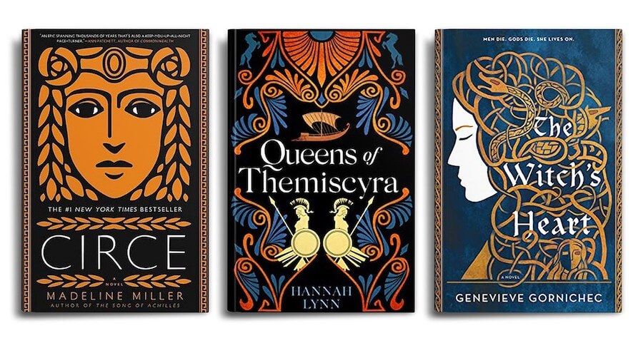
I’ve now designed 32 covers for Jean Gill, including the previous covers of The Troubadours Quartet back in 2015.
But trends change, readers start to want something different, and I think as time goes on, we are getting pickier and pickier as readers. We don’t want to waste our time reading something that is going to disappoint us.
That really hit home for Jean after I designed her new series look. It made her want to revive her previous medieval series so that it could stand up proudly next to her new books in the hope that there would be some piggybacking when the first book of the new series came out.
She said that Amazon ads weren’t attracting any clicks and she also found a 5-star review included this embarrassing comment: ‘Ignore the covers – this is a great series.’ (Granted, I did design the first set of covers in 2015!)
She was getting readers despite the covers, which meant that there was a mis-match between cover, book genre, description and target audience.
Other books of hers have 5-star review comments like: ‘I thought the cover was amazing and made me want to read it.’ This was what she wanted for The Troubadours Quartet.
Since I already knew the series, and because she trusted me, she left the creative part mainly in my hands. She knew I knew what I was doing, and sent me the following information for inspiration:
- Stylised (see inspiration – LOVE The Wife of Bath & google ‘courtly love’ for suitable medieval images (pref early- 12th C Occitan or French but if it works, it works)
- Important/possible symbols/ motifs
- Lute /oud
- Medieval musical instruments
- Music (no staves but musical notes OK)
- sword / helmet / knight (not plate armour but yes chain mail)
- Knight on black horse
- Woman very long black hair (or hidden)
- Roses/ rose garden & thorns
- very geometric French-style hedged garden aerial view
- Dragon in quarters of a shield (for Dragonetz – we had the dragon on the sword hilt but I can’t find the original of that)
- courtly love poses if any people, pref stylised (Wife of Bath) but manuscript inset possible (about conventional, less trendy).
She had also sent me the following comp covers for inspiration, which were a great help:

And some stock images she thought I might be able to use:
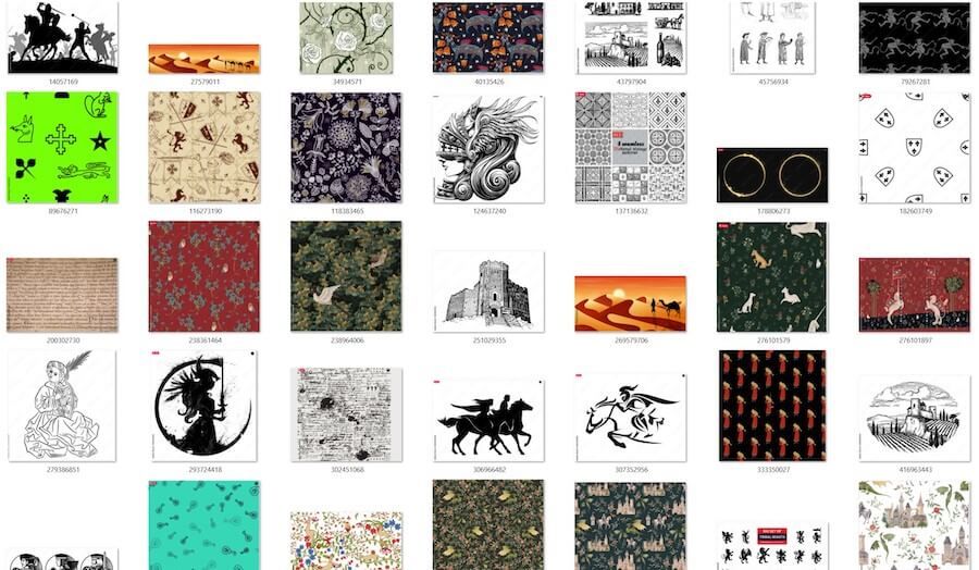
She kept messaging me thoughts that would pop into her head when she knew I’d gotten started. I said ‘yes dear’ and largely ignored her while I was at work with my first concept (I’m sure she suspected that was the case!)
I knew what the series was about since I’d also designed the first set of covers, but if I hadn’t a clue about the content of the series, I would have also asked her to answer the following questions for me:
- What genre is your book?
- What kind of audience are you targeting?
- What era is your book set in? What aspects of this era are prominent in your book?
- What is the setting like? Please describe it to the best of your ability. What aspects of this setting are prominent in your story?
- Describe the appearance of your main characters (eye color, hair color/length/shape, etc.)
- What are the themes explored in your book?
- Do you use any recurring symbols (literal or metaphorical) in your book?
After a full day of messing around with ideas in Photoshop, I came up with this:
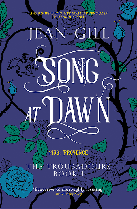
And it was a winner! We made a few small tweaks, and then I adapted the same concept to the rest of the series. We had quite a bit of a fiddle with color combinations, but in the end didn’t deviate too far from our instincts.
Here is a before and after of the set (before is on top, after is on bottom):
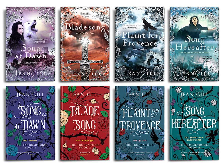
But wait … it’s not really that simple, because ultimately, it’s up to you, as the author, to be open to accepting the trends, and open to trusting your designer. I am very lucky that most of my clients trust me 100%. This allows to me to do my very best work.
As Jean says, “I have learned to let go. Briefing does not mean micro-management of detail.” I couldn’t have said it better myself.
Would you like to see some other recent makeovers of mine? Here you go (top is previous cover, bottom is redesigned cover):
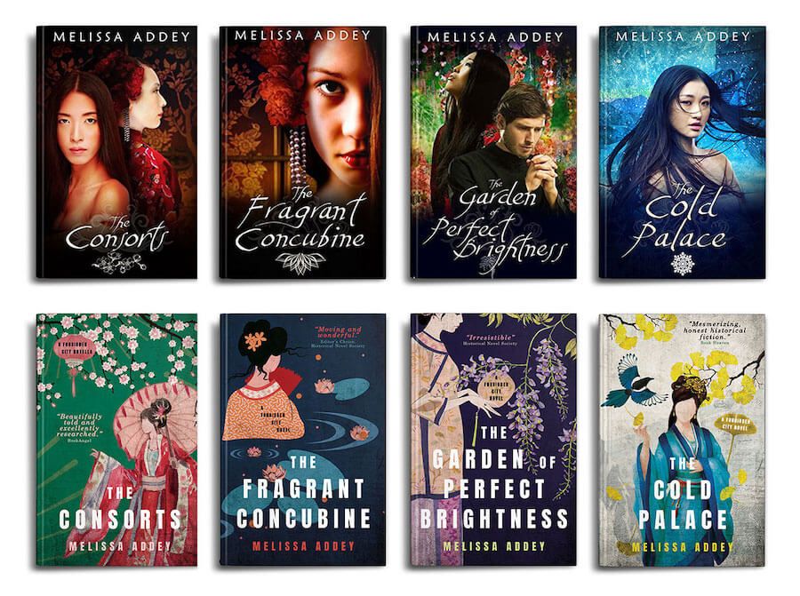
Nowadays readers buy what they recognize as something they’ll enjoy. They don’t have to love the cover (though it does help), but they do have to be attracted to it enough, for whatever reason, to pick it up.
And here is a second makeover I did, with the new cover on the bottom:
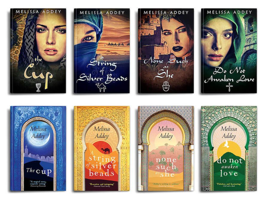

For more of my book cover designs, check out my design website and my publishing house website.
Subscribe to my newsletter.
Connect with me on social media: Instagram
And if you want more advice on how to redesign a cover, as well as lots of cover examples, you should check out my book!
About the Author:
Jessica Bell is an Australian multi-award-winning author/poet, a highly sought-after and award-winning book cover designer who is recommended by Dave Chesson of Kindlepreneur, Makeuseof.com, John Fox of Bookfox, and more. She is also a singer-songwriter.
Her latest book is called Can You Make the Title Bigga? The Chemistry of Book Cover Design.
She is also the Publisher of Vine Leaves Press, and currently resides in Athens, Greece, with her partner and son, and a pile of dishes that still don’t know how to wash themselves despite her consistently teaching by example.
Learn more about the book
Understand the chemistry of book cover design in Can You Make the Title Bigga? by award-winning book cover designer, Jessica Bell, who is recommended by Dave Chesson of Kindlepreneur, Makeuseof.com, John Fox of Bookfox, and more.
Are you self-publishing? Can You Make the Title Bigga? will inspire you with practical, actionable advice and information.
Work in marketing or graphic design in a publishing house? It offers an invaluable resource.
Studying graphic design? Already designing book covers professionally—or with dreams of doing so? Find inspiration for designs, workshops and classes.
From Jessica Bell’s witty, kind, and thoughtful perspective, you will discover:
• why book cover design is so important, whether you’re self-published, indie, or traditionally published
• the elements of an eye-catching, professional cover design
• how to research and choose potential book cover designers
• some of the biggest challenges an author and a designer face during a collaboration
• the balance between creating a book cover the author loves, the designer loves, and a potential reader loves
• how to prepare for a collaboration
• how to ensure a smooth sailing collaboration
• costs and recommended designers
and much more!
Includes over 100 color book cover design examples and information about project agreements, how to obtain puff quotes for your book, how to obtain ISBNs, a list of standard trim sizes, and binding options.


One thought on “How to Redesign Your Book Cover”
So funny to re-read our email exchange and the cover makeover has been a huge success – thank you, Jessica. This really is a must-read book for authors and cover designers.